The Font of Frugality
Fascinating research unearthed by Matthew Stibbe on the HP Business Answers site.
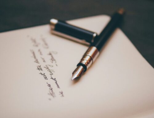
Changing font has a material impact on your printing costs. If, like me, you still tend to print a lot of your work out for proofing (yes, Luddite I know) – and you find yourself bemused at the frequency with which you change ink cartridges – then a change to font may be the answer.
In research by Printer.com, Century Gothic (this, slightly scratchy and insubstantial looking font) used 31% less ink than the world’s favourite, Arial.
Century Gothic was the most frugal ink tested, with an estimated annual business cost (based on 250 pages per week) of $179.
Times New Roman – the editors’ favourite – ranked third at $184.
Arial came in at number 6 with a cost of $258.
Of course, there are far more important considerations about readability, audience preference and design – and I suspect that few of us have the patience to constantly change fonts for printing – but interesting nonetheless.
All of which reminds me of a recent book: Just My Type by Simon Garfield. I happened across an episode of the book’s serialisation on BBC Radio 4 and thought “if only my Must Read shelf wasn’t creaking”. It’s an almighty feat to render something as apparently prosaic as fonts fascinating.